Simply Perfect Baking
A real small business that sells frozen dough- from challah dough, to cookie dough and rugalech dough. This business currently uses Jotform and Instagram for marketing and orders. I designed a responsive website to view images, order products and more from where ever you are!

User Research
I conducted 5 user interviews to determine how users purchase goods online, and specifically how users purchase frozen food online. I also asked participants who have bought from Simply Perfect Baking, or similar at home bakeries, how they prefer to order and pay for their baked goods- what works for them about the current methods and what doesn’t.
My key findings were that people prefer to see pictures of items they are buying before buying them. They also prefer to have a website over using Jotform, because it feels more ‘official’ and like their order was actually received. Users are comfortable with paying in a variety of ways- zelle, venmo, credit card, apple ID.
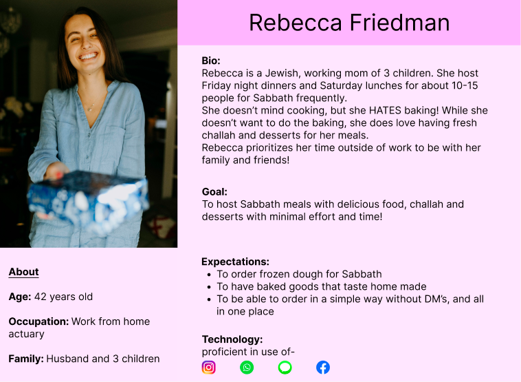
Persona
Branding

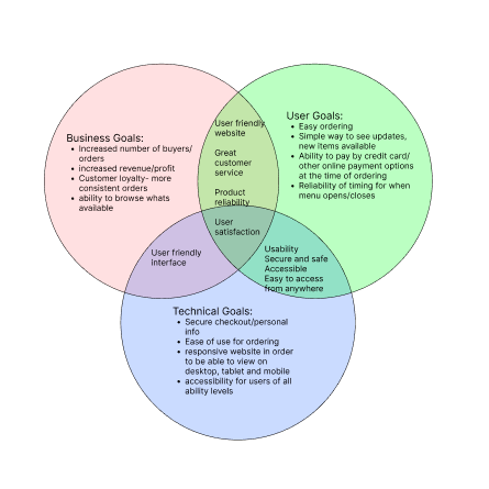
Project Goals
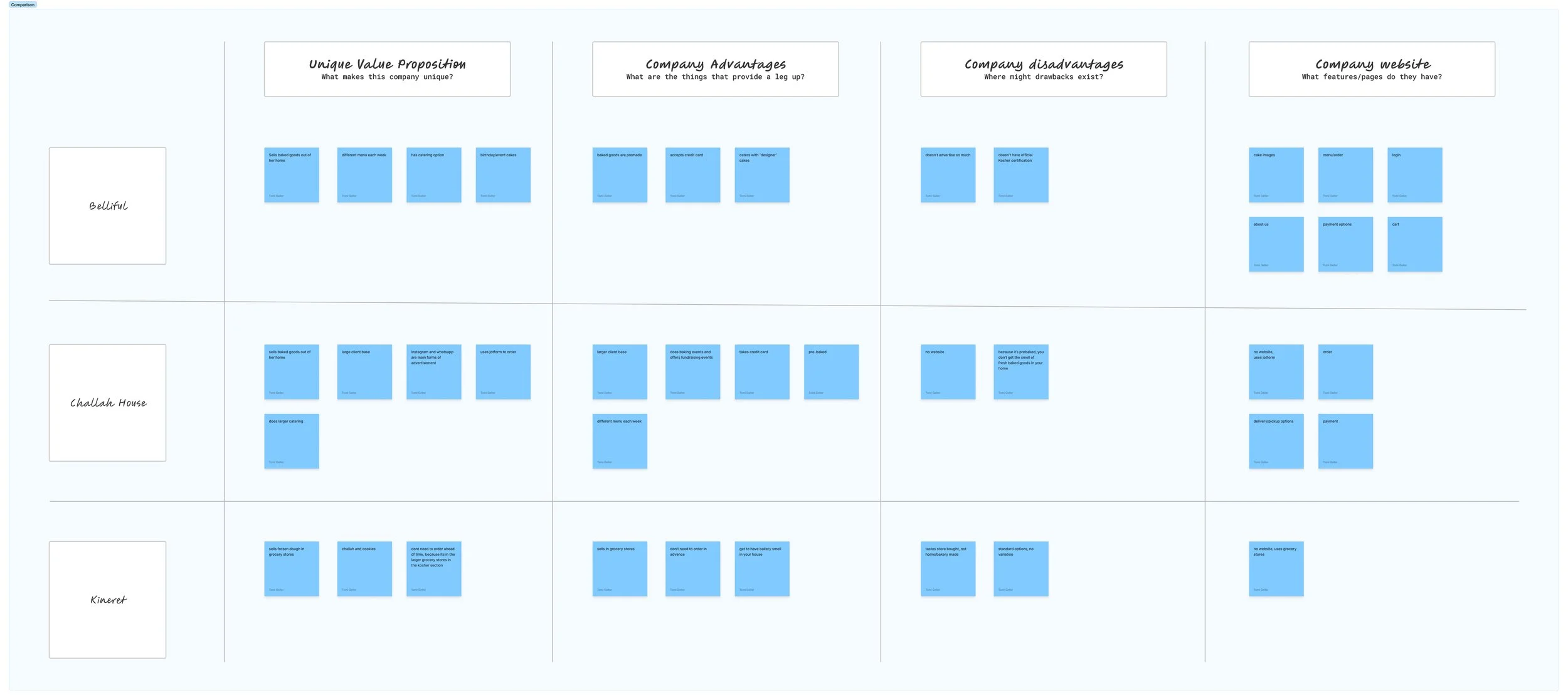
Competitor Analysis
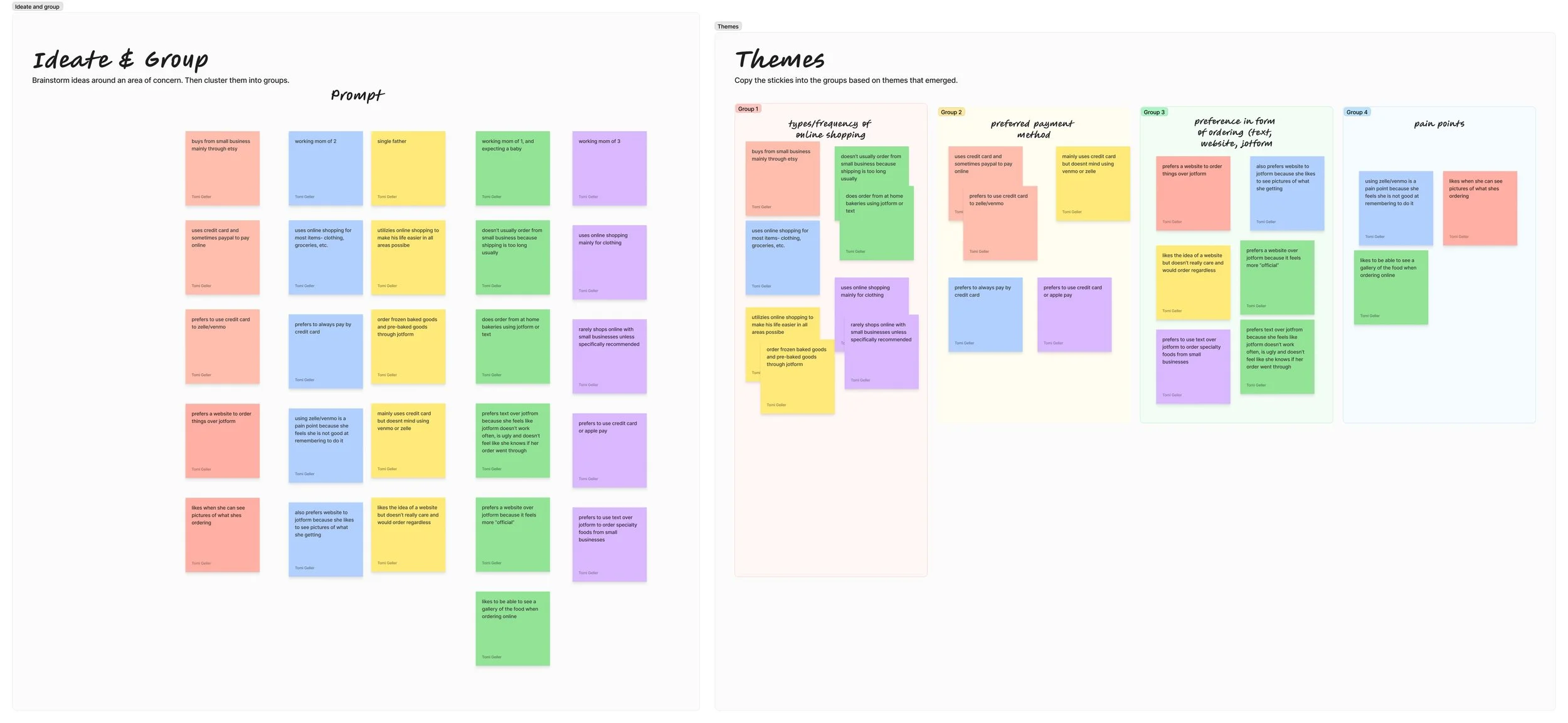
Affinity Map
User Flows

Low Fidelity Mobile Wireframes
Click here to view all low fidelity mobile wireframes on Figma.

Low Fidelity Desktop Wireframes
Click here to view all low fidelity desktop wireframes on Figma.

High Fidelity Mobile Wireframes
Click here to view all high fidelity mobile wireframes on Figma.

High Fidelity Desktop Wireframes
Click here to view all high fidelity desktop wireframes on Figma.

Final Prototype
Usability testing helped identify what was missing, what needed to be changed and what should be completely removed or moved to a different page
Testing
I conducted moderated testing with 6 potential users. Users were asked to complete 2 tasks: 1) Order 3 large plain challahs, 2 chocolate chip cookies, and 1 chococlate rugalech with delivery to Skokie using a credit card. 2) Order 2 mini sweet challahs, 1 Grandma R cookies, and 2 chocolate rugalech; with pickup and using zelle.
Results:
Overall, there were minimal to no errors with both task flows on mobile or desktop. Some limitations were because not every single button on the prototype works. If all buttons worked there would be no errors. Orders were placed quickly. It was confusing that when you put something in your cart, then go back to the menu, nothing changes about the item on the menu (i.e., “2 items added to cart”). Cart icon needed to update when items were added. A remove item button in the cart would be useful. On mobile buttons should be full screen for accessibility. Each item card in the list should be press-able, rather than just the + button. Items would benefit from a description so that you know how many come with each item. The added to cart popup should disappear after some time rather than needing to click out of it. “Added to cart” and check mark should be more prominent in the added to cart popup. The grid /list view should be marked clearer when chosen.
After testing, a lot of these results were taken into account and changed on the design. For example, the shopping bag icon now updates with a number in the bag to indicate how many items are in the shopping bag. The item cards were made into buttons rather than simply the “+” button for accessibility- making it easier to press/click.
Final Thoughts
If there were no time constraints for this project, I would continue to make modifications to add in descriptions, as well as work on more of the feedback that was given and observed during usability testing.